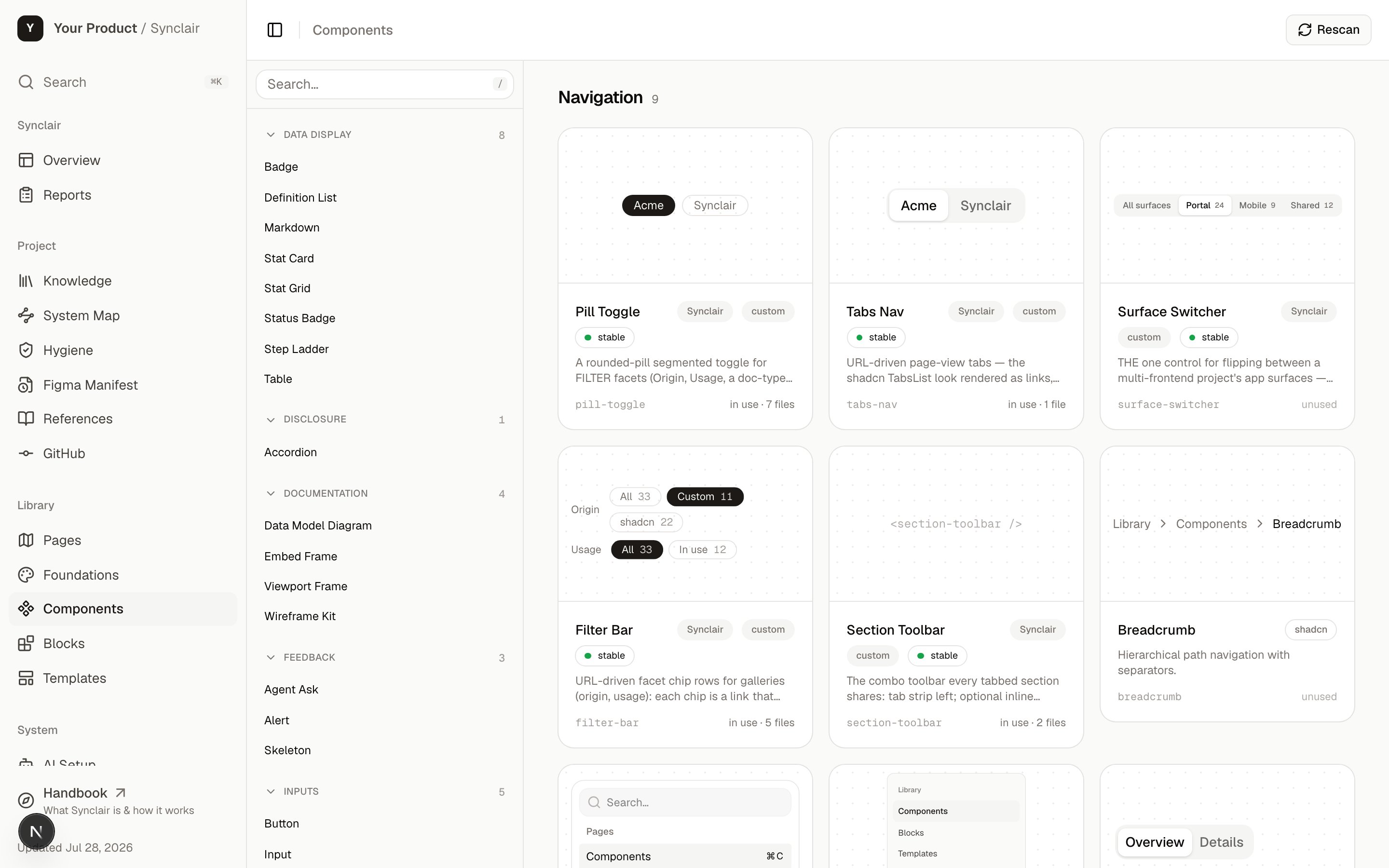
The Component library at /synclair/components — the filterable catalog with live card previews.
What it is
One catalog, split into three tiers by altitude — how much of a screen each piece represents:Components
/synclair/components — the primitives. Buttons, inputs, badges, cards — the
smallest reusable pieces.Blocks
/synclair/blocks — composed sections. A sidebar, a data table, a stat row —
several components assembled into a purposeful unit.Templates
/synclair/templates — full page layouts. A dashboard, an auth screen — the
frame a real view drops content into.What’s in it
Each tier is a gallery of card previews — live thumbnails on a dot-grid stage — and each item has its own doc page (/synclair/{tier}/[name]) with:
- A preview stage — the real component rendering (not a screenshot) on a Storybook-style canvas: a device-width switcher on every tier (components get desktop / 768 / 375; blocks and templates add wide and fullscreen), a stage light/dark flip that previews the opposite theme without touching the page, and a Code toggle with one-click copy. (In existing-app mode, host components are documented from their source and tagged “Host”.)
- The API — props, types, and variants, derived from the source.
- States & examples — the meaningful variations, each rendered.
- UX documentation — for blocks and templates: intent, an anatomy wireframe, interaction rules, and responsive behavior.
What a doc page gives you
Open any item and you get the documentation a design system actually needs — intent, anatomy, interaction rules, responsive behavior, the real API — beside a live preview you can flip between viewports and themes.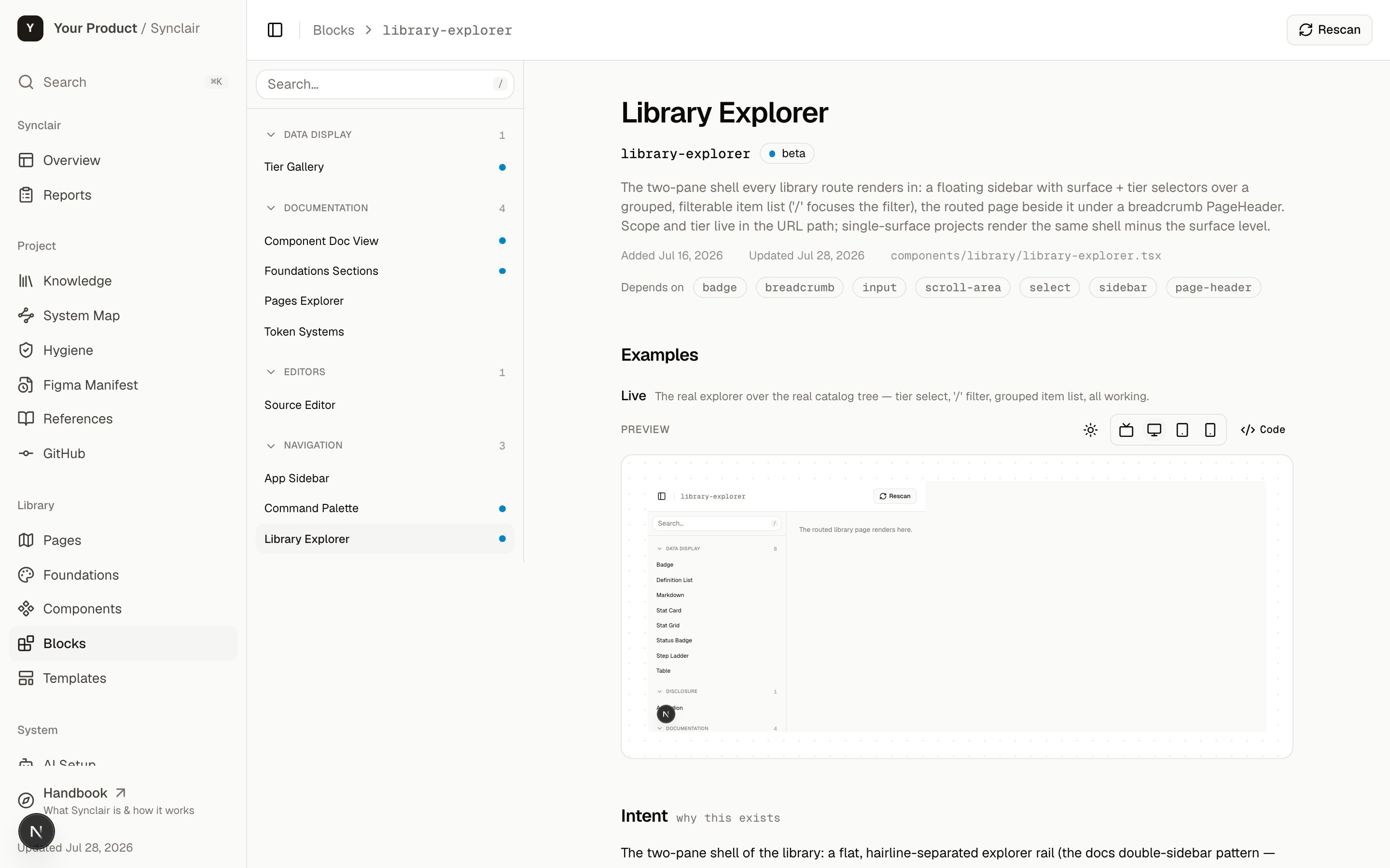
A block's doc page. Depth scales with tier: a component needs less than a block, a block less than a template — and docs are commit-anchored to the source they describe, so drift is flagged instead of quietly accumulating.
How it works
The catalog is driven by one registry (registry.json, the shadcn format) with a
colocated *.docs.tsx file per item. The galleries, doc pages, and search all read
from it — so the catalog can’t disagree with itself.
Two rules keep the library from rotting, and both are machine-enforced:
- The invention gate — before anything new is added, you have to prove no existing item covers it (extend or compose instead). New UI is a decision, not a reflex.
- Everything must render — a registry entry, its component, and its docs are
checked to stay in sync (
check:registry), and every item must actually draw its preview (check:previews), never degrade to a bare code snippet.
/synclair/library, so a web button and a
native button coexist without colliding.
How to act on it
Find and reuse something
Find and reuse something
Browse the tier galleries or hit ⌘K. Each doc page shows the API and an
install snippet — reuse beats reinventing, which is the whole point of the gate.
Create a new component
Create a new component
Use the
component-library skill. It walks the invention gate (does this need
to exist?), then the registration ceremony — add the component, its registry
entry, and its .docs.tsx, so it shows up in the gallery with a live preview.Document a block or template
Document a block or template
Use the
ux-doc skill to author the intent, anatomy wireframe, interaction rows,
and responsive rules — commit-anchored to the source so drift is caught
(check:ux-docs).Catalog a host app's components
Catalog a host app's components
In existing-app mode, run
existing-project-intake (or the component-cataloger
digger) — host components are documented from their source without importing them,
and appear tagged “Host”.Prove it all holds together
Prove it all holds together
Run
npm run verify-ui — the gate that runs typecheck, the token/lint guardrails,
the registry drift check, and the render-coverage check. It’s the definition of
“done” for any library work.Related: Foundations
The library is built on the design tokens — the color, type, and spacing
vocabulary that the lint guardrails enforce.